How shall we find the concord of this discord?
—William Shakespeare, A Midsummer Night’s Dream
Big news coming out of the Su Lab today! As you may know, we’ve been doing a lot of work recently on the presentation of our datasets stored in BioGPS. After we completed the ability to easily browse and view datasets, we wanted to take it a step further and make it possible organize, simplify, explore and alter the presentation of the data. Our current data chart plugin was updated over the summer and that got us thinking about how to improve and aid insightful discoveries. We wanted to be able to easily load up a dataset to view, and just explore. If a dataset has factors, how do they looked aggregated, how about aggregated on multiple factors while still allowing us to order them any way we please? Modifying the visualization should let you to decide how you want to display the data for your own use.
To make this change, we started from the ground up. Today we’re releasing an entirely rebuilt Data Chart plugin in beta mode. This new plugin has all of the same features of the previous Data Chart plugin in addition to a wealth of new features. The aim of this beta release is to introduce the new chart to everyone so we can start to get feedback on the user experience behavior and features.
To best introduce the new plugin, lets walk through a simple example: If we load up the new plugin with dataset 1839 we’ll see the expression levels of CDK2 across 82 different samples. From the start, the expression levels for all the different samples should look something like this:
While this chart contains a lot of information, it’s extremely difficult to infer any details about what the data may be waiting to tell us. There is simply too much being displayed to extract anything useful by visual inspection. Let’s first get rid of most of these sample bars and aggregate them together based of the disease state. You can reposition the order of factors by dragging the respective factor box left or right. We then aggregate on disease by toggling the lower checkbox on the factor bar for disease. I also chose to hide the other factors by toggling their upper checkbox. The result looks like:
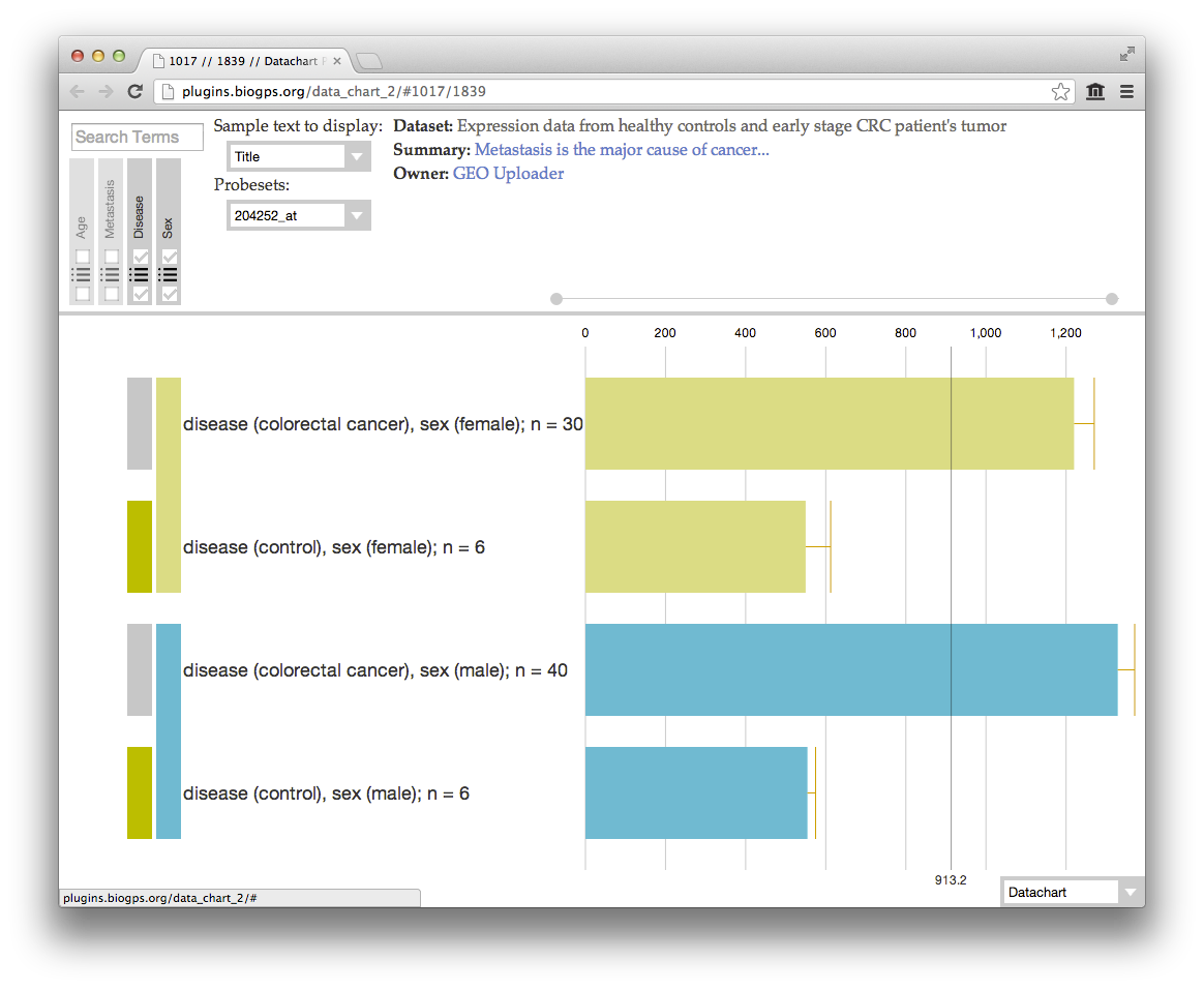
Okay, great! We can now see that there is a significant difference in CDK2 expression between the colorectal cancer and control samples. If you’d like to move the control samples up, factor options can be reordered by clicking the list icon on the factor box. The error bars that appear after aggregation show the standard deviation of the sample values that were aggregated. Let’s look further, is there an expression difference between gender? Aggregating on disease and sex looks like:
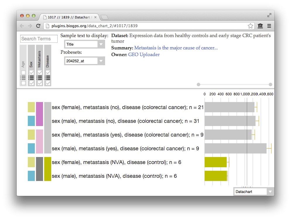
It’s now clear that there appears to be an insignificant difference in expression between gender. Lets investigate if the metastatic state affects the expression of CDK2 in our samples. We do this by toggling the lower checkbox on the metastasis box. You’ll also noticed I moved sex out the the way and first ordered by disease. This results in a chart that looks like:
We can now easily see that the metastatic state is not correlated to CDK2 expression with our diseased samples. The hierarchical organization also visually shows us that a metastatic state is not available in our control sample for obvious reasons. From start to finish, it’s easy to explore the data contained within our datasets in a completely visual manner without any technical literacy. This plugin is just the first step in our efforts to expanding the visual beauty of intuitively exploring biological data.
An abbreviated list of some of the new features available in the plugin are as follows:
- Sorting: Sometimes we want to rearrange all the different options for a given factor. Alphabetical, sequential, or to our own liking. The plugin lets you drag to rearrange the order of each factor option.
- Aggregating: Ever want to aggregate all the samples on a specific factor? The new plugin allows you to select a single or multiple factor type to aggregate on. This groups all of the samples that share the different factor options. This updates the standard error of the mean between the aggregated samples and then recalculate the mean value for all the different, newly aggregated sample bars.
- Search: Just as before, the new Data Chart plugin allows you to search across samples. As you change the display text you want to show, the new chart updates the search to act on the currently displayed text. When samples move around, the search updates to stays smart about where your highlighted samples may have moved to.
- Saving: Often we’d like to revisit the plugin while retaining the dataset sorting or aggregating arrangement from when we were previously browsing. The new plugin keeps track of your display settings for a particular dataset. It will also keep track of your last viewed history so you will always be presented where you left off.
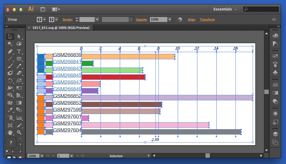
- Export as SVG: We love the current plugin’s capacity to save as an image. However, this returns a PNG image file which gives us no access to the different components of the chart. We wanted an easy way to rearrange labels, change colors, remove tick marks, and other small use cases which would make the web interface too complex. To get around this, we created a way to save out the currently viewed chart as a scalable vector graphic (SVG). SVG is a graphics standard which allows you to scale the chart up to as big as you’d like without any loss in resolution. To save out the file simply toggle the view type in the bottom right corner and then either right click and “Save As” or just drag into a destination folder on your computer.
For those with common SVG editing programs like Adobe Illustrator you can load up the saved file, and will have access to all the different regions in the graphics. This allows you to delete regions, changes colors, add a watermark or any other modification you want without altering the quantitative scales of each sample bar or potentially adding pixelation. This feature gives you the full customization for post-processing the presentation of your dataset.
In addition to the listed features, the new plugin better handles data requests to BioGPS, has more informative tooltips, allows different sample label types, has a new dataset browser and many more features.
(or use as a stand alone web application)
There are many datasets on BioGPS that don’t have factors or other metadata and thus can’t use most of these improvements. However, we still think this update will be a big improvement as you’ll be able to treat a plain dataset just like you had before. This rewrite of the previous plugin more easily allow us to improve its performance, add features and fix any issues you might find in the future. Please please please send any requests, improvements, comments, or bug reports — you can submit them directly onto the Bitbucket issue tracker here, or contact us through the normal channels. We are releasing this as a beta exactly so we can get your feedback! This plugin is entirely open source and freely available on Bitbucket to remix, improve, and release back into the public!


Very cool stuff here.
I would love to see this post reflected in a YouTube screencast. Would really help folks reproduce the analysis you did and more quickly understand how to use the tool.